News

Meet The Man Behind A Day To Remember’s Killer Artwork

Awesome.

Meet The Man Behind A Day To Remember’s Killer Artwork

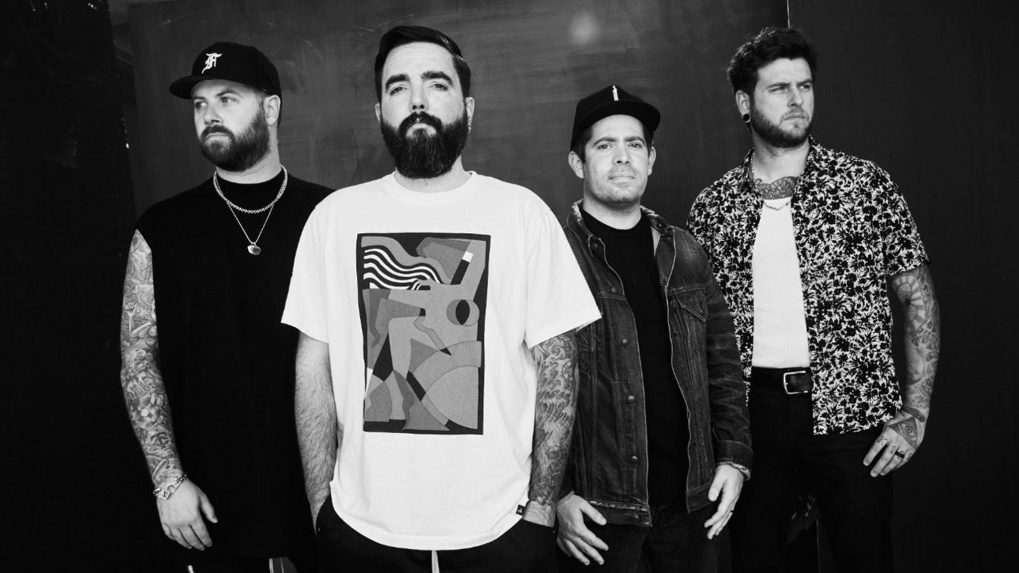
It’s about time you meet one of the greatest artists in rock… 

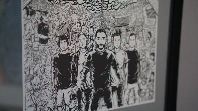
In this week’s Kerrang!, we’ve teamed up with Mike Cortada – the man responsible for A Day To Remember’s Bad Vibrations artwork – for an exclusive ADTR illustration. If you’re a fan of the band, it’s not to be missed!

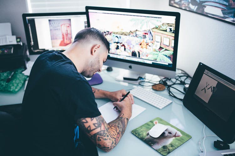
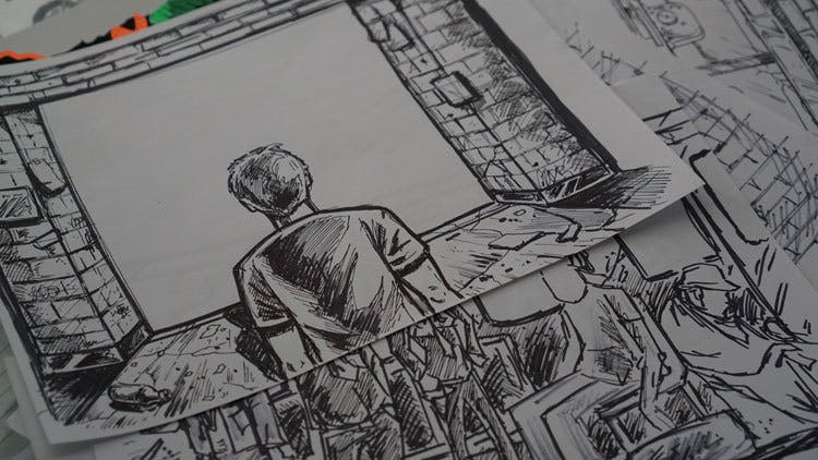
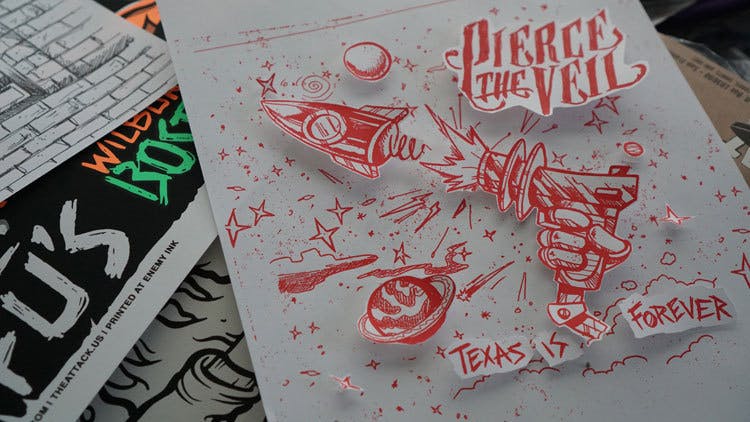
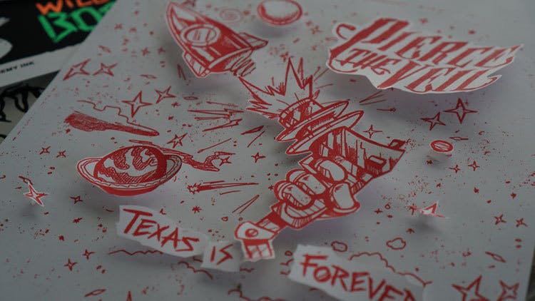
Mike has worked with ADTR and bands including All Time Low, Pierce The Veil, The Wonder Years, Fall Out Boy, Sleeping With Sirens and more for over a decade now – you’ve probably got a T-shirt designed by him in your wardrobe – so we sat down with him to take a peek through his sketchbooks, and find out how one of rock’s most in-demand artists produces his iconic work.

HEY MIKE! PLEASE INTRODUCE YOURSELF TO THE KERRANG! READERS…

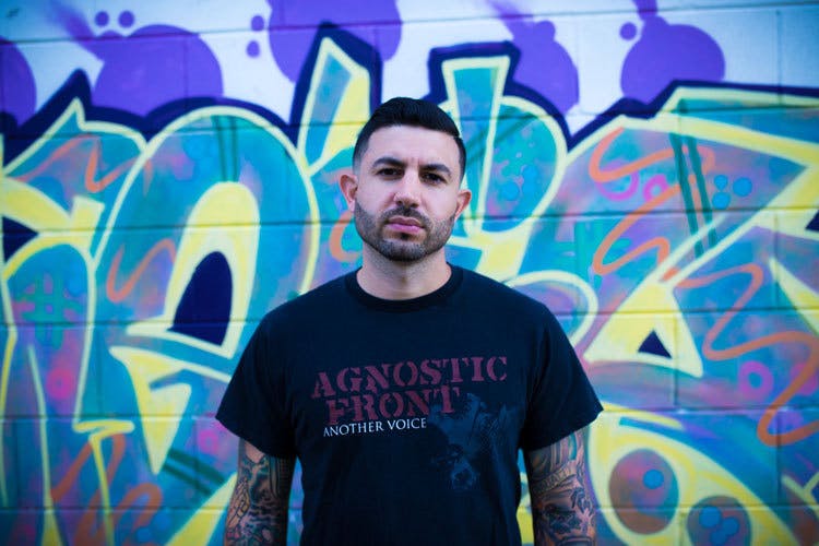
“Hello! My name is Mike Cortada, sometimes tagged under the name MikeC Hardcore. I’m an illustrator and designer for everyone in the music biz. I’ve been creating stuff for bands for 20 years or so, full-time for well over a decade.”

YOU WORKED WITH US ON OUR A DAY TO REMEMBER COVER FEATURE FOR THE NEW ALBUM, BAD VIBRATIONS. YOU’VE WORKED WITH THE ADTR GUYS A LOT; HOW DID THAT RELATIONSHIP START AND DEVELOP?

“The ADTR guys and I have worked on countless projects together – I would think at least a few hundred at this point – and they’re great guys to work with. I’ve designed hundreds of apparel pieces for them, worked with them on album artwork [Common Courtesy/For Those Who Have Heart/Killer B Sides/All I Want Single/ Violence Single/Homesick Special Edition], and I created the artwork for the new album Bad Vibrations. I’ve also designed most of their live stages, like the House Party Tour, and Parks & Devastation. I’ve even worked with them on their music videos, too – 2nd Sucks, Right Back at It Again, and so on. Working together has always been easy because we’re all basically from the same area. They were more north in Ocala, and I was here in Central Florida, the Orlando area, so we weren’t too far from each other. Back in the day, I was working on art for shows and bands in our area. I played in hardcore and punk bands and worked with a lot of bands in that genre. ADTR were playing shows all over and people were really starting to recognise them, and one day Josh and Jeremy hit me up and asked me to do a few designs. I had never heard their music before, and their style wasn’t what I was into at the time, but they were very cool and had some interesting ideas. We hit it off, and made some designs that went over very well, and we haven’t stopped since.”

WHEN IT CAME TO THE BAD VIBRATIONS ARTWORK IN PARTICULAR, HOW DID YOU COME ABOUT CREATING THAT? WHAT CONVERSATIONS WITH THE BAND LED TO THE PIECE WE SEE ON THE ALBUM COVER TODAY?

“The Bad Vibrations project was very intense, to say the least, and I’m extremely proud of the final result, but we definitely had our share of obstacles. The band had these great songs and an album title, but no real vision for the direction of the art. They knew they were going to keep it with the classic ADTR theme, but it had to be a darker, heavier vibe over all. That’s when I hit the drawing board. Normally, I come up with something and it hits the spot first try, but this one was not so easy. I would create a cover based on the vague ideas the guys had, and I’d text them a picture. Neil would then chime in and offer more direction, then I’d create the changes. Then Jeremy would be inspired and suggest something until we were in a fully-fledged artistic brainstorming session, and I was drawing in real-time as the band gave me input. I created a paper mock-up of what the layout was gonna look like. I wanted it to be something very special and unique with a lot of depth, which you guys will see when you get your hands on the Deluxe Bad Vibrations album! I made a video of how it would all work out and sent it to the guys. They loved the idea, but the illustration style wasn’t quite where they wanted it. After a bunch of additional cover sketches, Jeremy said he liked one in particular. It was just right. So I rolled with it, and it organically grew. The colours just came naturally, and the cover and entire album is a pretty intense and outrageous art piece made upon hundreds of illustrations, all hand drawn, pen-to-paper, and scanned. I have a stack of the elements so thick that it looks like an encyclopedia.”

YOU WORK ACROSS HUGE CAMPAIGNS FOR A NUMBER OF DIFFERENT BANDS, DESIGNING ARTWORK, LOGOS, MERCH AND MORE. IS THERE A PARTICULAR MEDIUM YOU GET THE MOST ENJOYMENT OUT OF CREATING?

“To be honest, I love it all. I love diving into various artistic styles and unusual projects. For example, aside from the album covers and merch, I’ve designed stuff like toys, vinyl records, plush dolls, hot sauces [for PTV], giant inflatable heads [for ADTR at Warped Tour], skateboards, shoes, music videos, and also non-music stuff like a giant wall mural for a children’s hospital. To be honest, it’s all fun as long as the people I work with are chill and allow me to do what I do best. Sometimes you have clients that can be overly critical, pick apart things, and offer too many suggestions, and that most often damages the creative process which leads to something that isn’t up to its full potential. If I had to choose, I’d say tour stages and branding are cool cause you can see people from all over the world come to the show and enjoy the stage art and merch. There’s nothing better than knowing your creation is bringing people happiness.”

YOU’VE ALSO BEEN RESPONSIBLE FOR A NUMBER OF ALBUM COVERS IN OUR RECORD COLLECTIONS, FROM PIERCE THE VEIL TO THE WONDER YEARS. WHAT ARE YOU FAVORITE ALBUM COVERS YOU’VE EVER WORKED ON?

“It’s hard to say what’s my favourite because I’m very proud of most of my work. I think it’s a tie between The Wonder Years’ No Closer To Heaven, Pierce The Veil’s Misadventures, Sum 41’s 13 Voices, and A Day To Remember’s Common Courtesy.”

AS AN ARTIST, EXPLAIN TO US HOW THE PROCESS WORKING WITH BANDS GOES. IS IT A HIGHLY COLLABORATIVE PROCESS? HOW MUCH DO YOU DISCUSS WHAT EACH BAND IS ATTEMPTING TO CONVEY BEFORE YOU BEGIN WORK ON YOUR IDEAS? DO MOST BANDS COME TO YOU WITH A CLEAR IDEA, OR DO YOU ATTEMPT TO TAKE THE MESSAGES AND THEMES OF THE RECORD/BAND AND CONVEY THEM THROUGH YOUR OWN ARTISTIC FILTER?

“The process is different for everyone. I’ve got clients like The Wonder Years and PTV, where we talk on the phone or text pretty much every day or so. That’s ideal because I know the band inside and out, so there’s a free exchange of ideas from everyone. I also already know what works for them, so a lot of times I just go off and create stuff on my own. Sometimes you work with a label/manager and they just say, ‘Do whatever you want,’ and that’s when I get to go crazy. Luckily, I’m at a point where people respect my work ethic and trust in my artistic judgment, and that confidence really allows me to go all out with it. As far as being inspired by the bands’ music, I almost never listen to a band when I’m working with them. For example, with ADTR, I didn’t listen to them until years into working with them. What if the band is awful? Then how am I supposed to take them seriously?! I usually just put on something I enjoy like and start drawing.”

WHAT INSPIRES YOU AS A DESIGNER?

“The key to staying inspired is stepping out of your comfort zone. Every time I try a new project, I grow as an artist and it re-ignites my love for the craft. I am inspired by the music I love. I got a Rancid tape in the early ’90s and to this day, I still feel excited when It comes on. And now, I’m at a point where I can actually say I’ve designed for Rancid. Nothing can quite beat that – inspiring people through the artwork that you created for the band that inspired you. That’s some serious Inception stuff!“

WHAT BANDS THAT YOU HAVEN’T WORKED WITH DO YOU PARTICULARLY ADMIRE THE CREATIVE LOOK OF?

“I love the hand-drawn stuff of the first wave of punk, and I love skateboard art and graffiti. They’re not necessarily current bands, but I could tell you some of the albums whose art I love: Set Your Goals’ This Will Be The Death Of Us, NOFX’s Liberal Animation, Bad Religion’s Suffer, and the old Black Flag art like My War. I’m always impressed by the art on thrash records like Municipal Waste and Toxic Holocaust. Megadeth has cool stuff, and Agnostic Front’s Cause For Alarm record was totally rad as well. There’s so much great art, it’s hard to pick just a few.”

AS A MUSIC FAN, ARE THERE ANY BANDS YOU PARTICULARLY LOVE THAT YOU WOULD LIKE TO WORK WITH IN THE FUTURE?

“I’d love to work with maybe more pop stuff, maybe more hip hop, and I’d love to design for some classics like Rocket From The Crypt, Dinosaur Jr., or Black Flag. Maybe Justin Bieber or Dr. Dre! To be honest, whether it’s a giant group or a local band, I don’t even care as long as they’re cool to work with and good people – and the project itself sounds fun!”

FOR ANY KERRANG! READERS LOOKING AT THIS AND THINKING YOU HAVE THE DREAM JOB, WHAT ADVICE WOULD YOU GIVE THEM ABOUT EMBARKING ON THIS CAREER? WHAT MISTAKES DO YOU SEE PEOPLE MAKING THAT SHOULD BE AVOIDED?

“It’s a great job to have! There are times when you deal with projects that are not exciting, clients that you wanna slap in the face, and deadlines so ridiculous you feel like jumping out the window, but overall, being able to be creative and make something that brings joy to or inspires others is pretty rewarding. Stay humble, do it for the right reasons, be authentic and be yourself, and the rest will all fall into place.”

Be sure to check out more of Mike’s work for yourself by visiting Mikechardcore.com

Check out more:

Now read these

The best of Kerrang! delivered straight to your inbox three times a week. What are you waiting for?