
News
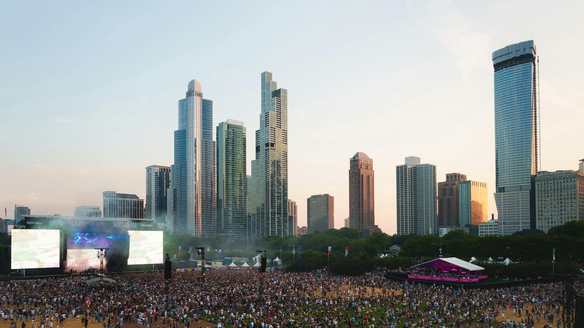
Here’s the clash finder for Slam Dunk Festival 2024
The Slam Dunk Festival 2024 clash finder is here! Get planning your day at Hatfield or Leeds (or both!) now…
Here are 10 bands whose visual styles are as iconic as their music.
Looking cool doesn’t make your music good, but it certainly helps in the long run. Having an aesthetic – not just a sound but a look, a colour palette, a stylistic theme that one is wholly committed to – is tough to pull off, but those bands who do so have a powerful weapon in their arsenal. These artistic profiles can sometimes be so strong that even bands who came before them are sucked into its pull, resulting in a lot of arguments over who wore it first or better. And while some bands have to tone down their look or buy Instagram followers to stay relevant, these acts have made themselves immortal by coining a feel that others identify with.
There's nothing wrong with changing one's look and feel from album to album – in fact, that very progression is what has made bands like Mastodon and Paramore exciting and current to legions of fans. But for those artists who can create a consistent, iconic, and versatile aesthetic, it's an advantage across their entire career.
Here are 10 bands whose aesthetic isn't just a look, but a way of life…
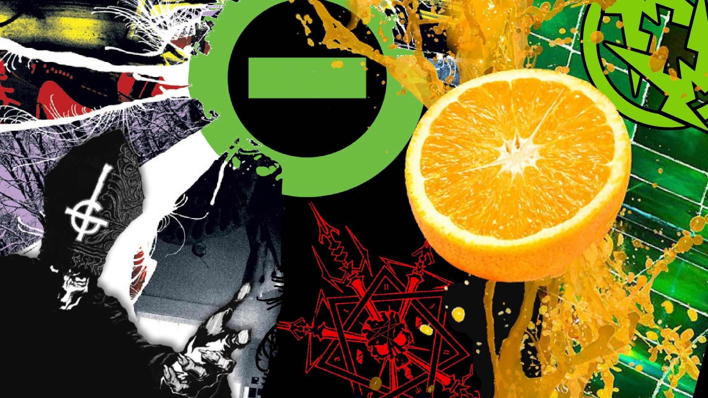
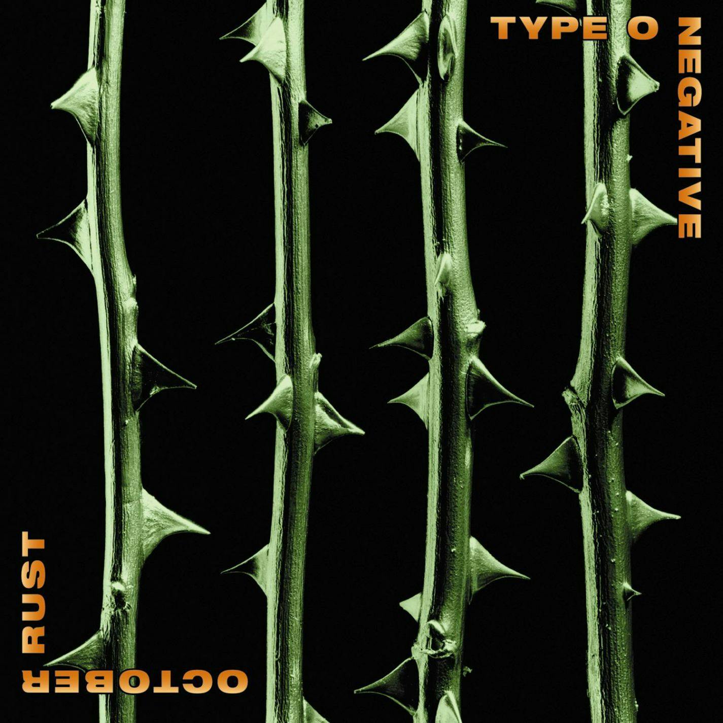
From the get-go, Type O Negative made some strong aesthetic choices that they’ve upheld over the years. Their exact shade of green immediately conjures the band into the minds of those that see it, while their dedication to bleak yet simple photos and imagery have maintained a seriousness where others have gone cartoonish or approachable. Their refusal to deviate from this look has given them a visual power that other bands – especially those in the goth realm – can only dream of embodying.
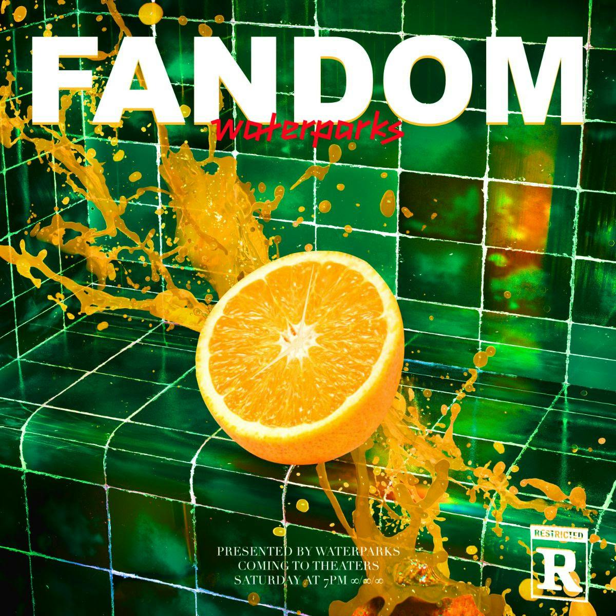
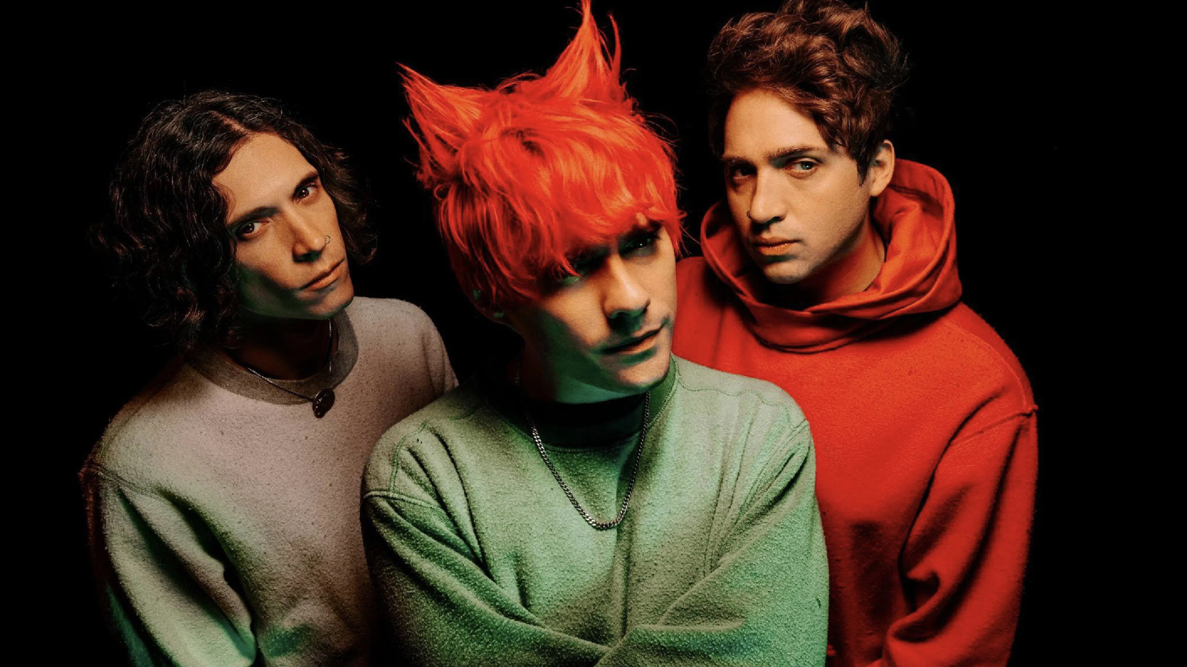
With Houston's Waterparks, the theme is and always has been colour. The band's plucky party-punk has always come with album art so bright that it stings the unprepared eye, with the audio and visual sides merging together to give them a standout identity. Frontman Awsten Knight even took things one step further on 2019's FANDOM album by dyeing his hair an Ecto Cooler green that made him a living embodiment of the band's approach. We're not responsible for any sunburn experienced looking at Waterparks' art…
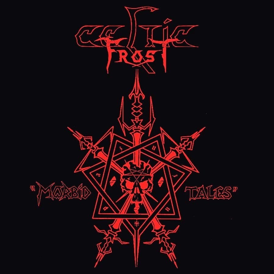
There’s a perfect spot between metal’s ultra-grimness and teenage innocence that is embodied in Celtic Frost's aesthetic. Though their designs are usually stark, eldritch and drenched in black, the Swiss proto-black metal gods also have a sardonic sense of humour to them apparent in the sketched sigil of Morbid Tales, the blasphemous slingshot of To Mega Therion, and the gothish synths of Into The Pandemonium. That, mixed with their grinding, syrupy riffs, allows their music to sound the way their albums look, and makes them the ultimate band for those who will never grow out of hating the world and every gibbering mammal who lives there.
Bright colours, melting corpses, and huge beers… Municipal Waste know what they’re about. The band have gone all-in on the late-’80s party apocalypse, drenching their music, art, and persona in all the madness and colour of an Ed Repka painting. Even the stark sketch on the cover of 2009’s Massive Aggressive has that rough, margins-of-your-textbook vibe to it. This gives the band a feel that some other thrash acts haven’t quite locked down, and which will always make them the ultimate soundtrack for the sweatiest sort of rager.
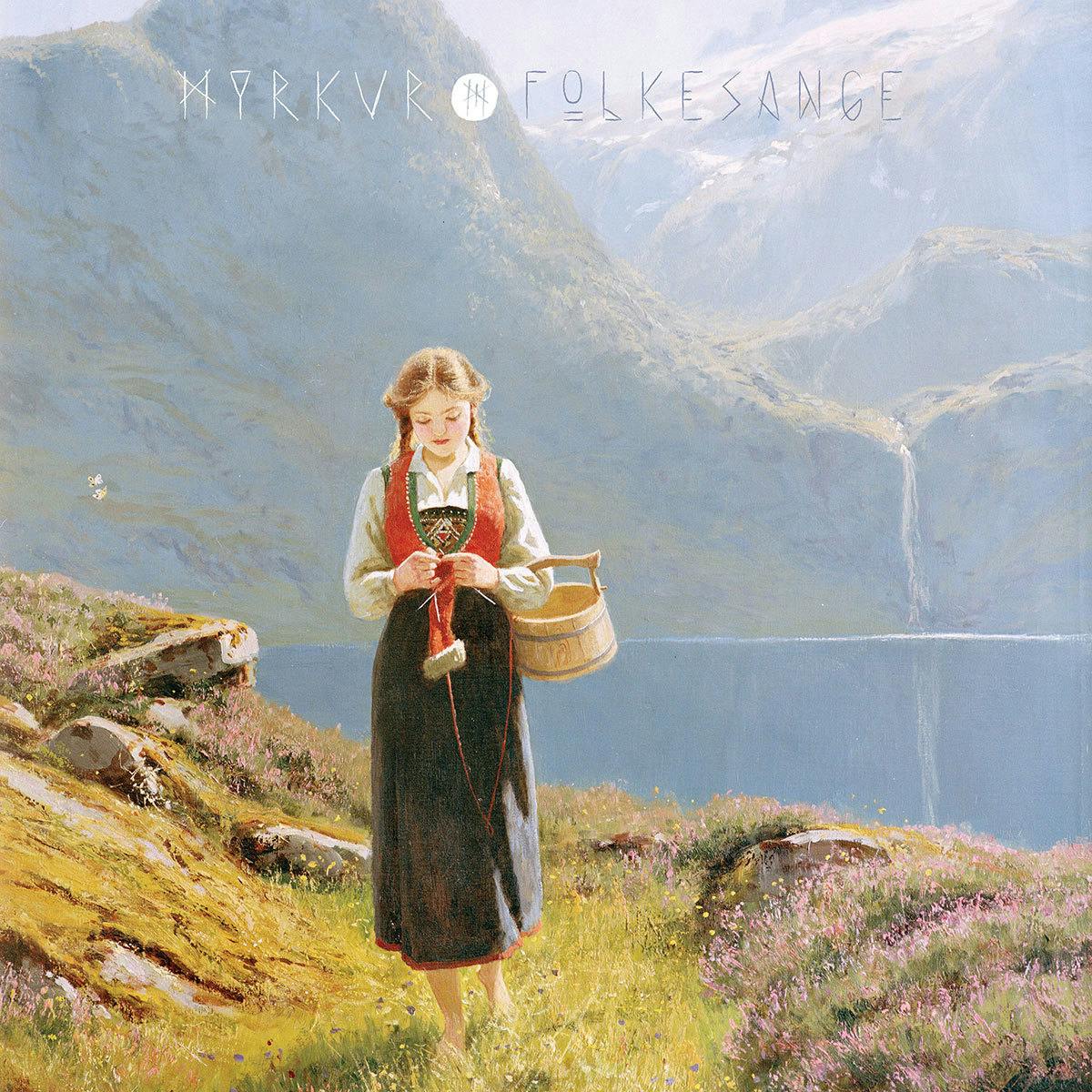
Words like ‘pagan’ and ‘folk’ get thrown around a lot in reference to Myrkur, but the vibe that backs all of the Danish performer’s music and visual art is more specific; perhaps the most accurate description would be that it feels like a crisp winter morning just before dawn. That explicit atmosphere is what makes her art especially compelling, and makes the listener feel as though they’re drawn into Myrkur’s world rather than the other way around.
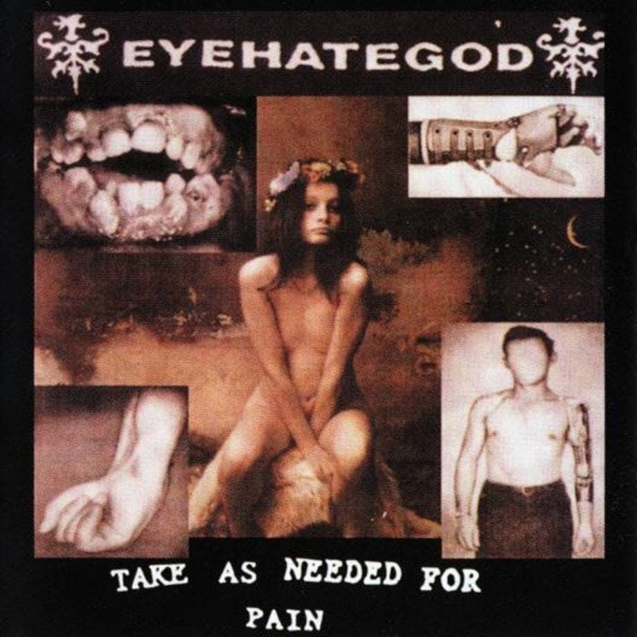
Sometimes, you just want to feel ugly. Eyehategod have that emotion locked down, the faded vintage medical photos and water damage that adorns their art working perfectly alongside their oozing riffs and junkie shrieks. The NOLA sludge band’s entire ethos and aesthetic revels in the honesty of decay, and leaves the listener feeling as though they’re scratching an infected wound even though they know they'll only make it worse. There's no room for beauty here.
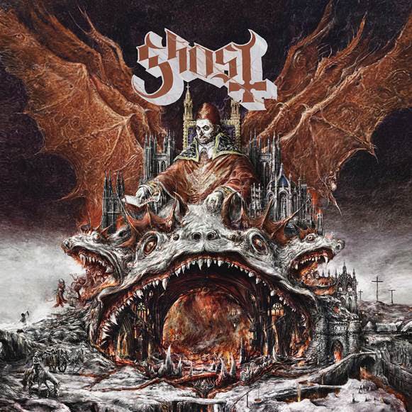
Over the years, Ghost have pulled from and parodied countless pieces of medieval antiquity and European horror art for their album and poster designs. But that has become part of Ghost’s aesthetic – the grand, artsy, oftentimes overwhelming imagery of classic Europe, just with added popes’ mitres and inverted crosses. That sense of overkill and expressionism is inherent in Ghost’s look and sound, making them a band who could’ve never come from London or Los Angeles, but only from a place with some sort of terrifying saint or intense silent film in its national memory.
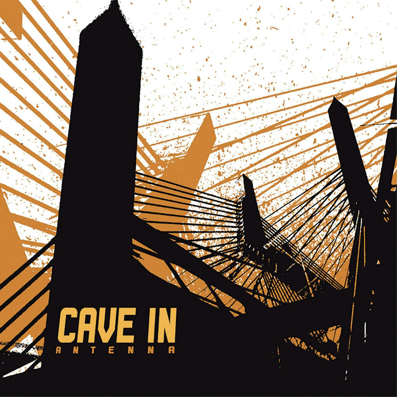
There’s no easy description for Cave In’s unique aesthetic. Industrial decay? The dark, mechanized side of sacred geometry? It's a mixture of sharp angles, ruined modernism, and a hint of the cosmic in the little things, that runs through both the album art and the core-deep sound of the Boston progressive hardcore legends. But this look and feel is deeply embedded into their identity, and helped change the broader aesthetics of math rock, hardcore, and everything in between.
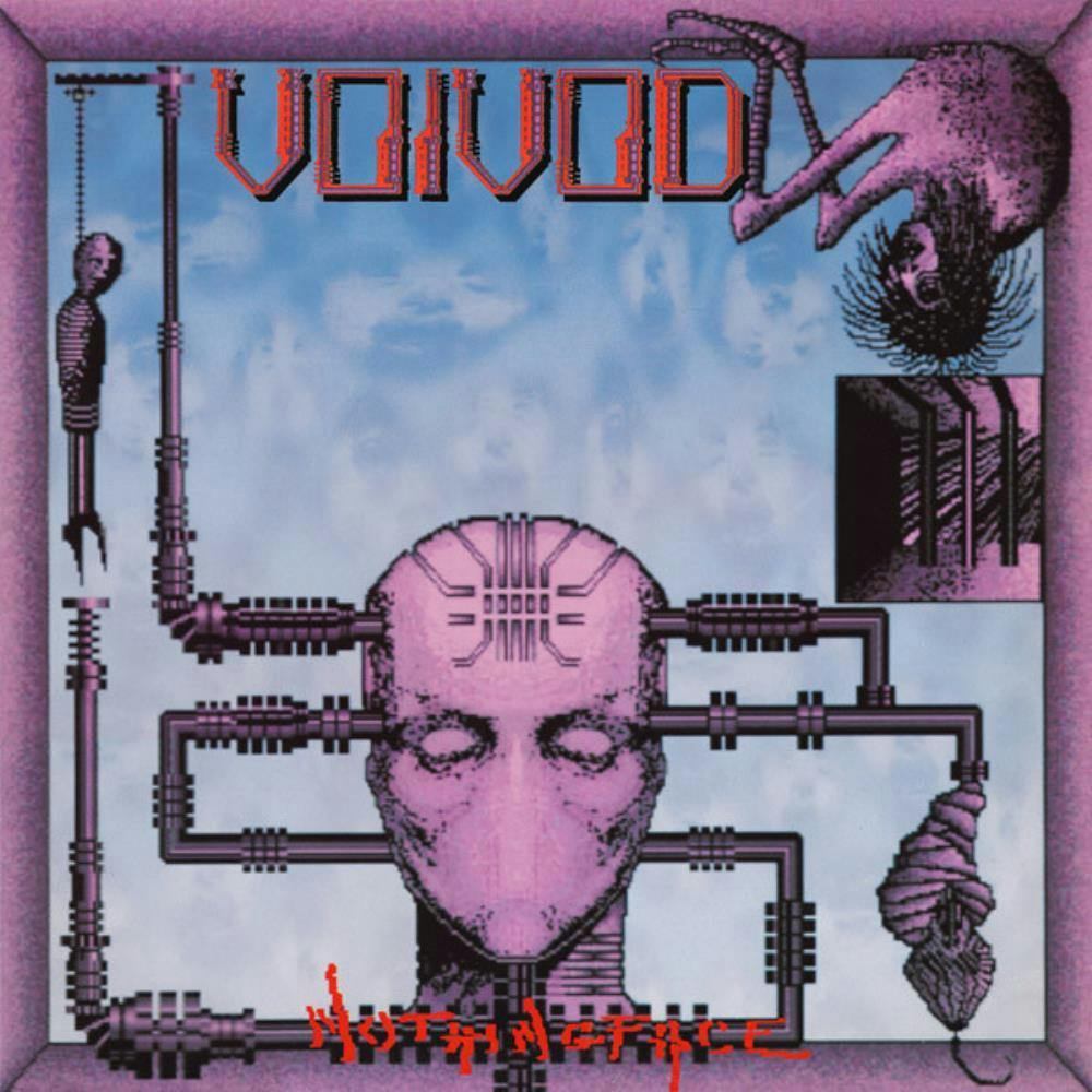
Plenty of Voivod’s aesthetic must be credited to drummer Michael 'Away' Langevin, who has created all of the band’s iconic album covers. His sharp-chinned skulls and mantis-like claws have informed much of the Canadian progressive thrash act’s outward attitude. But it’s the way these quirky-yet-arch designs merge with the band's zanier side that provides a unique take on metal which only Voivod can court convincingly. Simply put, few – if any – other bands could pull this aesthetic off.
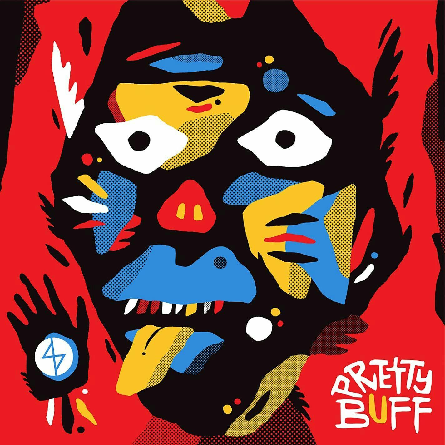
Unlike many of the acts on this list, Angel Du$t don’t work with only one artistic concept when it comes to the imagery surrounding their music. But it’s their use of hard-lined and firmly-coloured pop art alongside their tangible, loft gallery-esque hardcore punk that feels consistent even in its variety. Even the more elaborate colours of 2019’s Pretty Buff feel simple in their use and placement. The result is a look and feel for a band where the more things change, the more they feel united.