You might have clicked on this link while wondering, "How is it news if a band updates their logo ever-so-slightly?" In the world of twenty one pilots, though, everything that comes from Tyler Joseph and Josh Dun has meaning – and after amending their logo earlier in the week, fans have been speculating if this latest move might signify the end of the band's current Trench album era.
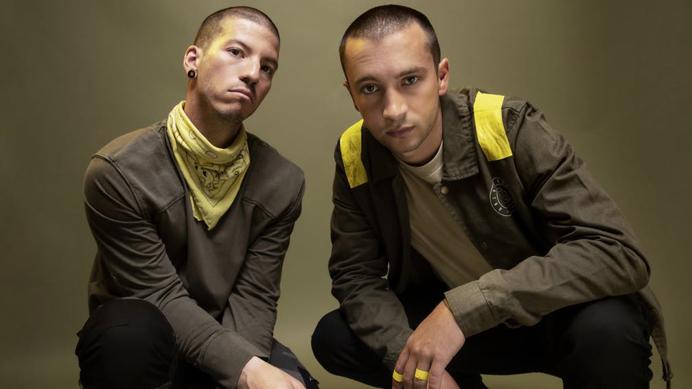
Of course, when the Columbus duo launched Trench in the first place last year, one of the many changes to their ever-evolving aesthetic was the logo – featuring an additional upwards and sideways slash to represent having "extra layers of protection", according to Tyler. But that logo was not only slightly faded, it was also a very specific shade of yellow to tie in with the themes of the record itself.
In a new, updated version of the logo, however, the lines are not only more solid, they are also a different shade of yellow – as spotted by eagled-eyed Reddit member user/king-of-the-clouds. It's linked to the way in which the duo started teasing Trench ahead of its release via the super-cryptic – and, to be honest, still confusing – website dmaorg, as well as the record's overarching storyline (nine bishops keep the inhabitants of a place called Dema from escaping its clutches with the help of the Banditos – a rebel organisation).
Read this next: Tyler and Josh from twenty one pilots: The songs that changed our lives
With that in mind, king-of-the-clouds notes that the file name on dmaorg for this GIF is labeled as _they_ca_ntseeFCE300.gif, with FCE300 being a "hex code" for a particular shade of yellow – the shade of which pretty much matches up with twenty one pilots' new logo. For reference, the original Trench era logo's hex code was different: F3EF00.
"People are also saying that the updated logo looks more "solid," or "complete," like the Banditos are getting stronger, and, assuming that the bishops can't see this shade of yellow, this would kinda play into that," they write.
"As for what that means for the Banditos and the overall storyline of Trench? No clue, but the color change is definitely there, and it was definitely intentional."